
CASE STUDY: IICT Social Media graphics update
I recently did an Online Brand Revamp for the Institute for Integrative Coach Training. This involved:
- Creating a unique header graphic
- Ensuring flexibility so it could be adapted for each individual Social Media channel
- Leaving enough space for tagline and logo to be added
- Creating the header graphics for Facebook, LinkedIn, Instagram, Twitter and YouTube to the exact dimensions for optimum visibility.
Creating the header image
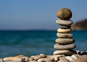
First off, we discussed what type and feel of image they wanted. We tried a variety of options, and they decided to go with the stone stack, which has a very ‘zen’ vibe.
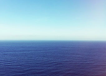
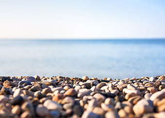
They supplied the stone stack image, and I sourced an ocean image on pexels.com. I was having trouble finding a suitable pebble beach on Pexels, so I searched on Shutterstock instead, and found the perfect one – it needed to be the right angle to look realistic.
A common problem with Social Media graphics is that you may find an image that looks perfect on one channel, only to discover that it doesn’t work on others; it may lose context due to how it’s cropped, or it just won’t look right.
Header image proportions are different for each channel; therefore, one size fits one! 🙂
That’s why I created a custom image that has the flexibility to fit all channels, which involved creating separate elements that could move independent of each other; in this case, the stone stack, the ocean in the background, and a pebbled beach.
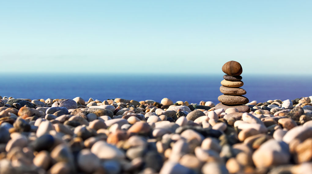
And this is the result. Did you notice the stone stack has fewer stones? 🙂 I had to shorten it a little to allow for very shallow header images, like on YouTube. Also, the stone stack needed to be a little ‘warmer’ in colour to fit in with the colour of the stones on the pebble beach.
I created a layered file in Photoshop, where I can move the ocean, stone stack and beach independent of each other to create the perfect fit for each channel. One thing to watch out for was to ensure the stone stack sits naturally on the beach, and doesn’t appear to ‘hover’ or ‘float’, with shadows falling naturally. As you can see, it sits behind a couple of stones, but in front of the ones in the background.
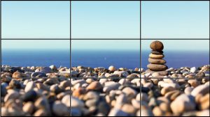
Notice how the essential elements are vertically centred!
In the middle third of the image, the stone stack, the pebbles, and the ocean are all visible. The stone stack sits to the right to allow for adding the tagline on the left and the logo on the right.
I also recommend having a bit more background available on the top and bottom especially (not visible) to play with if need be.
Creating the individual channel headers
Things to remember when creating social media graphics:
- Each channel has its own specification for size and dimensions, so using one image for all platforms will not work very well.
- Some will be responsive and some will be set (meaning some will adjust to the size of the browser window, and others will stay the same)
- They often have a different crop on a computer versus a phone or tablet
- Create them with a ‘worst case scenario’ in mind – ensure there is enough background for all channels. Starting with the YouTube header will give you an idea of what you’re working with.
There is a compromise somewhere of course – they’re not going to look perfect on each gadget. That said, there is a lot that can be done to ensure it looks its best however it is viewed!
Facebook page header
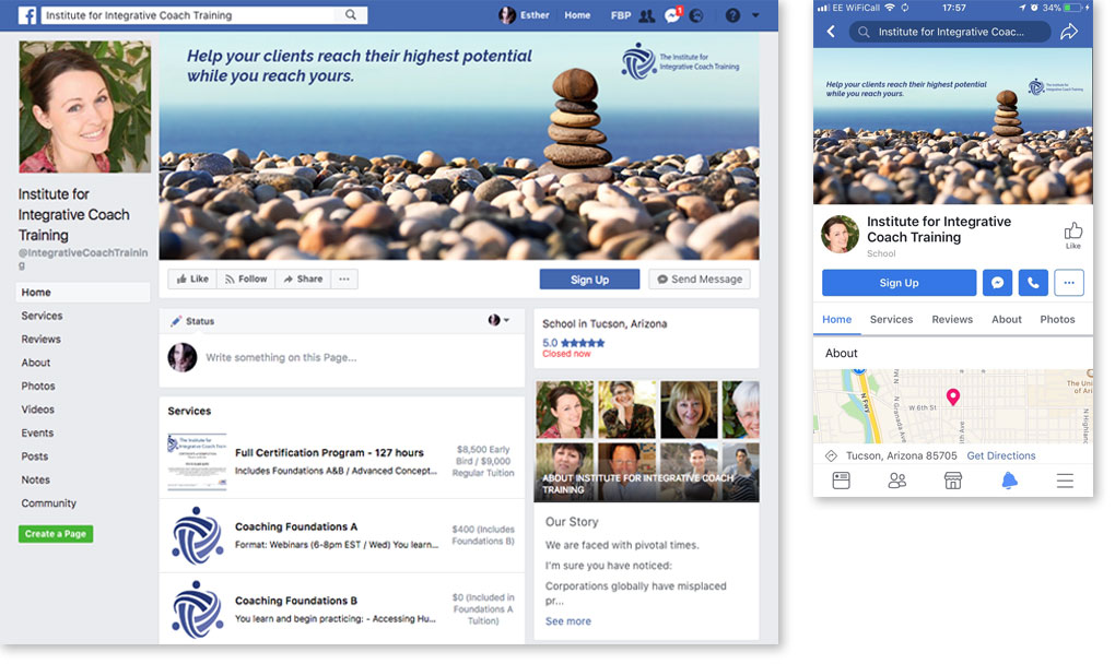
Note the clear area at the top and bottom of the mobile header image (right) – this gets cropped off on desktop (left), so it is important to keep any essential information away from the top and bottom.
LinkedIn header
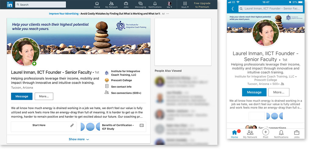
Keep in mind the clear area – the profile image is on the left on desktop (used to be centre), but still in the centre on mobile, where it’s also larger. The text and logo are visible on both desktop and mobile (at the moment, that is – they do tend to move the goal posts regularly!)
Twitter header
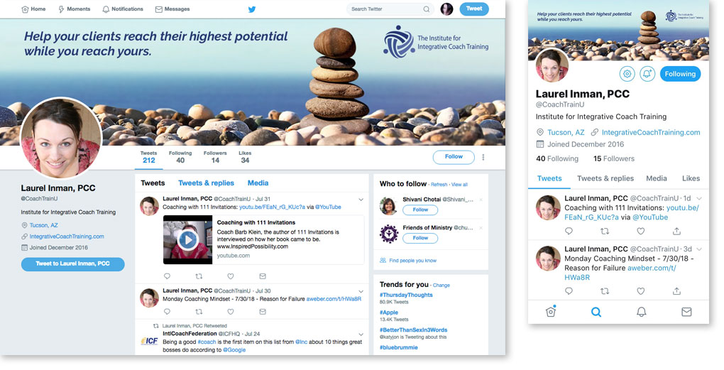
This is responsive, meaning it will adjust to the size of the browser window. On Twitter, the profile picture sits on the left on both desktop and mobile (at the moment). The layout is consistent with the other channels.
Instagram header
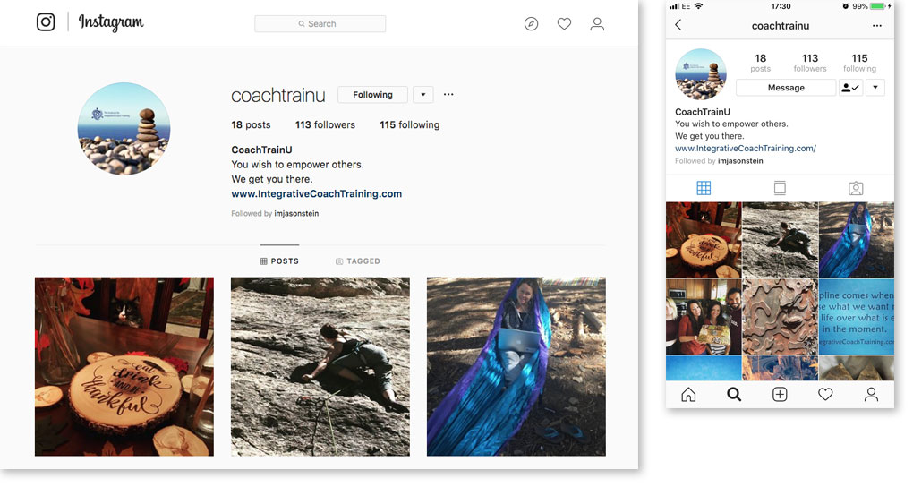
Although only very small, it’s good to bring in the consistent look of the brand here as well.
I hope this gives you an idea of how consistency can be applied to make your brand stand out online.
What can you do to make your brand more memorable and recognisable? If you’d like some help, get in touch and we can have a chat about how I can help you achieve a more consistent and memorable brand.
